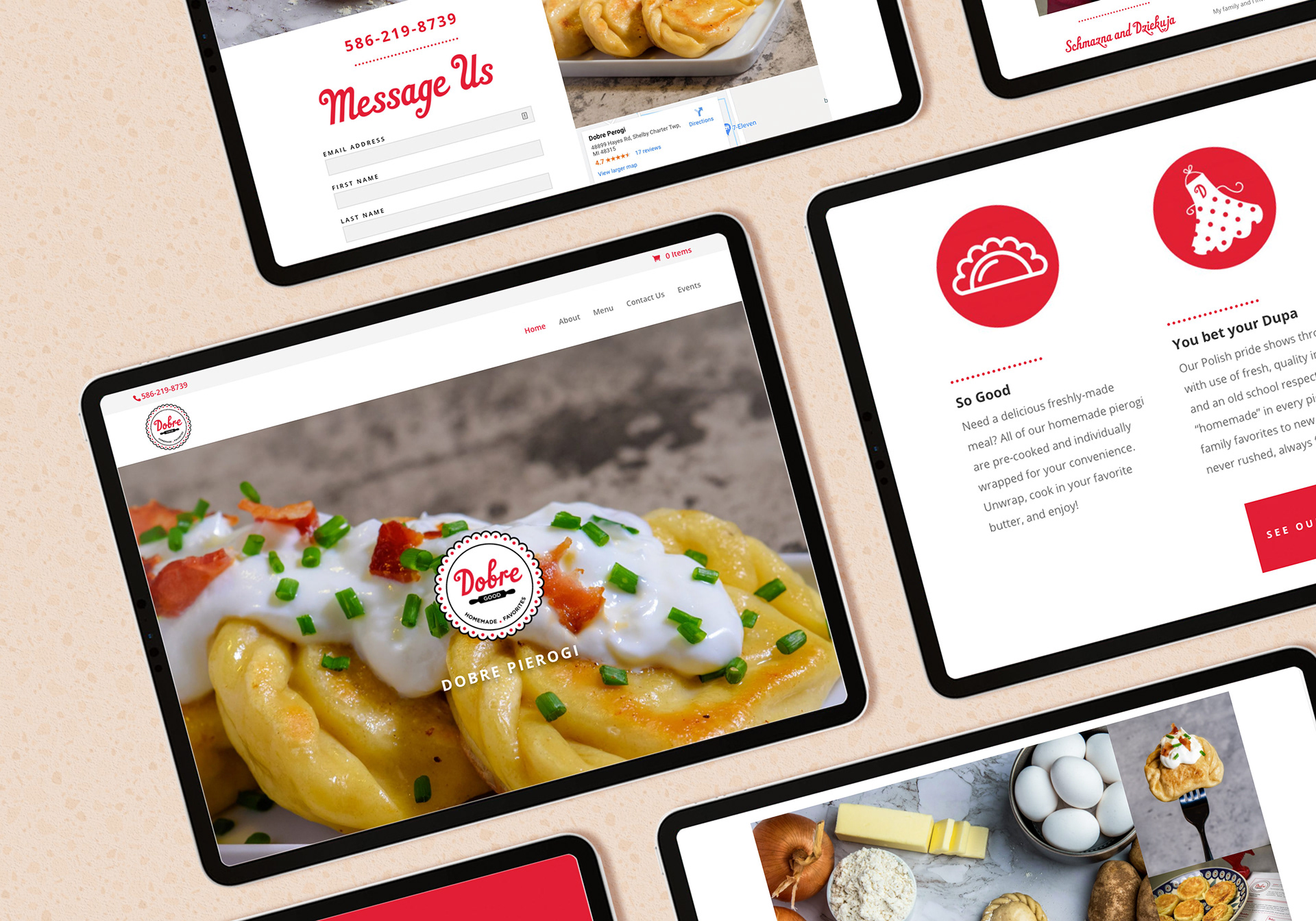
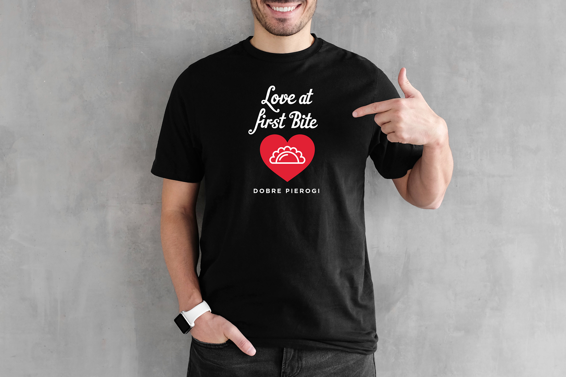
Creative direction of Dobre Pierogi branding, logo development and digital presence including visual design of website, user experience strategies, and website development.
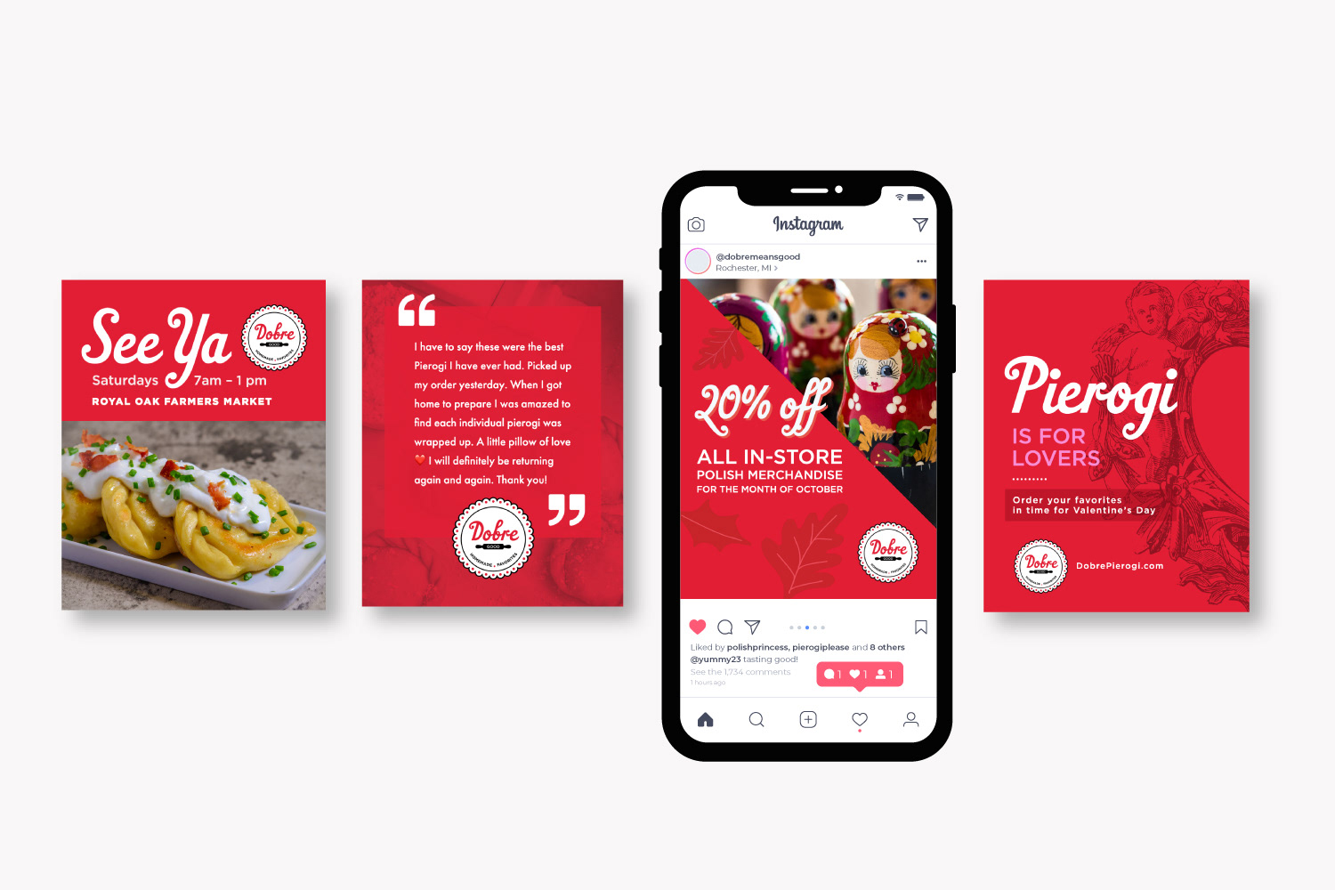
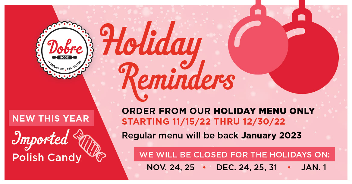
Provided art direction for photography, assisted with content creation, and designed social media marketing assets.
A "Good" Story
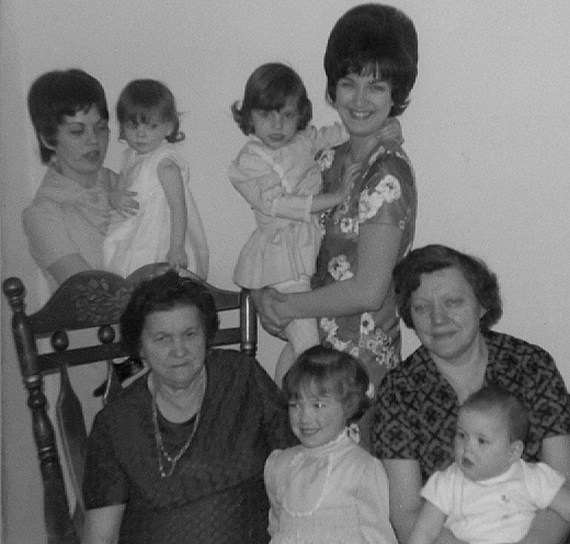
The owner of this small business has been making pierogi with her family since she was a little girl. Now in her 70s, this mighty entrepreneur wanted to share her family recipes with the public. "Dobre" means good in Polish, a fitting name that would describe the line of delicious pierogi products.
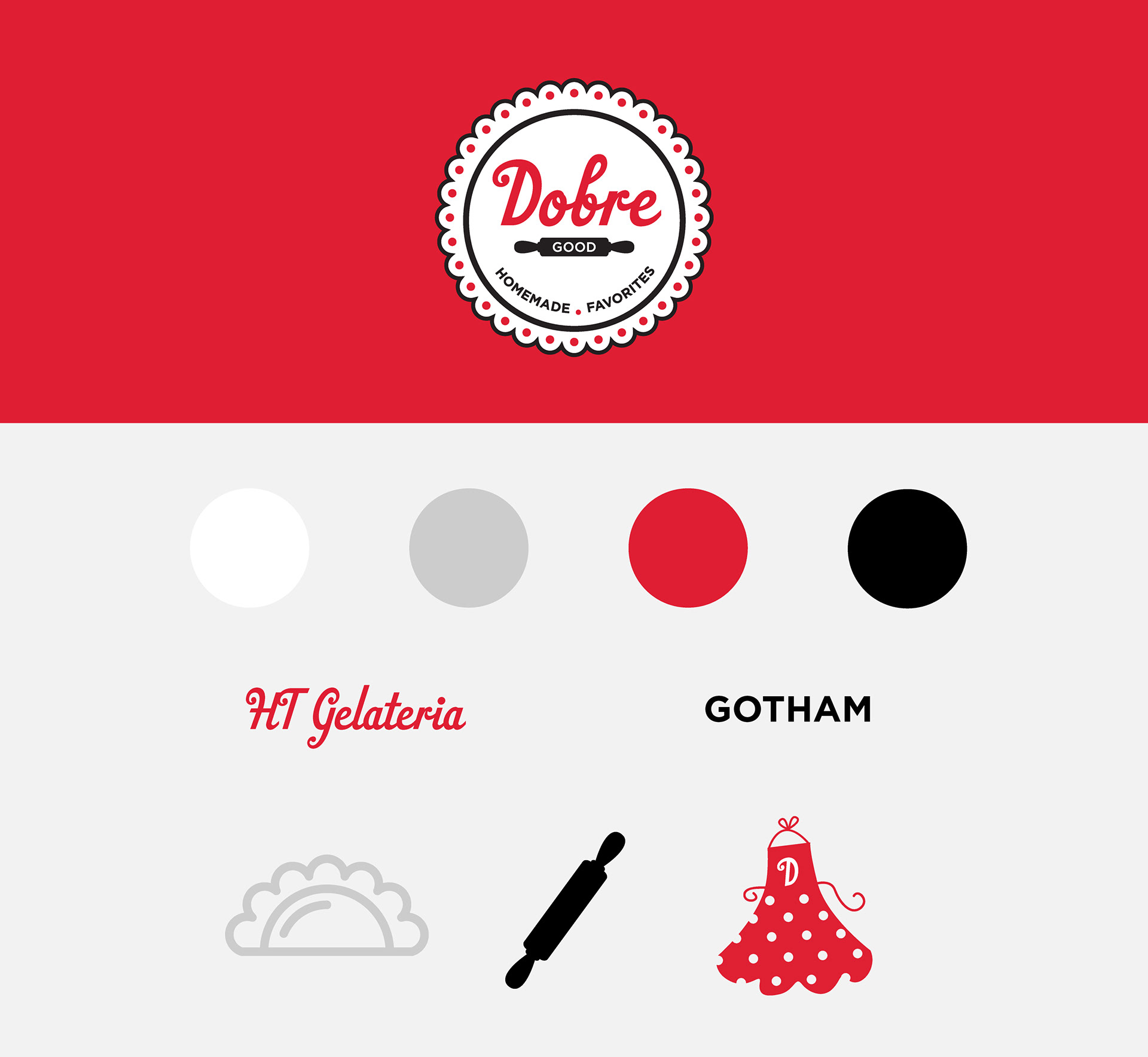
After interviews with the client, the brand needed to feel homemade (like Grandma's kitchen), a little kitschy, represent quality, and identify as Polish.
A competitive audit was conducted and it was determined the brand needed to stand out without using the typical Polish iconography.
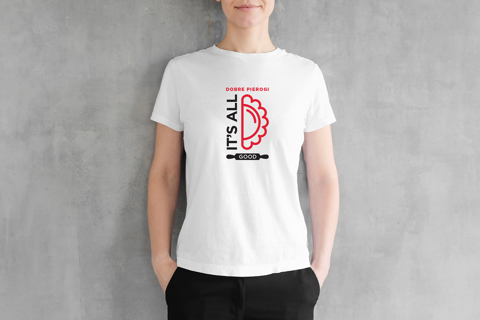
The design of the logo and brand voice represents the sense of Grandma's homemade goodness with a kitschy vibe. The simple color palette of red, black, and white is used to communicate Polish heritage.
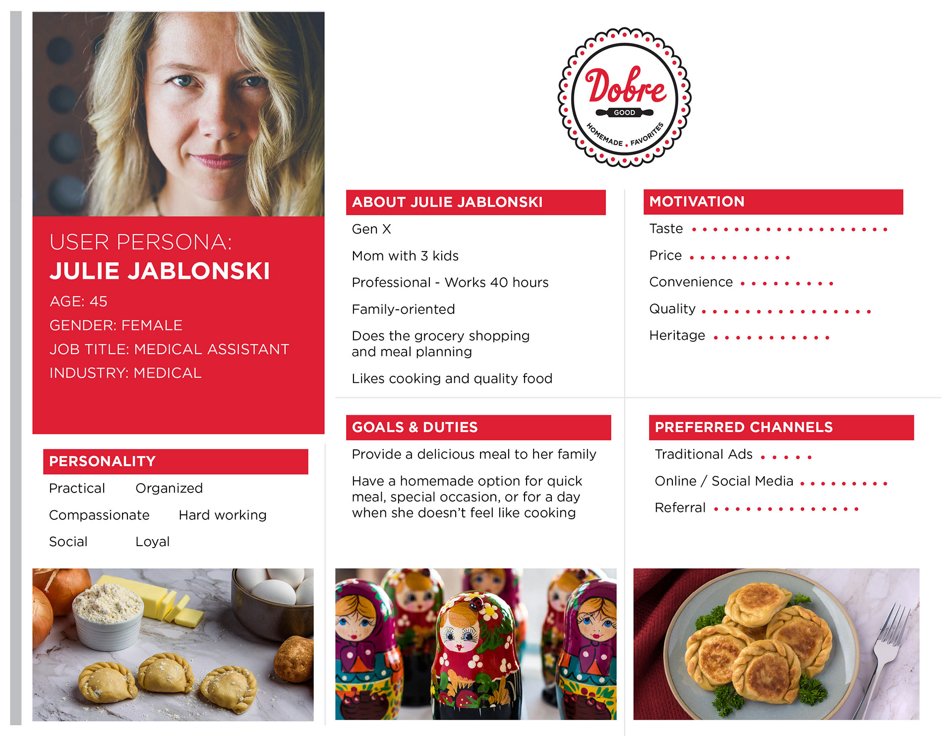
The goal of the digital presence was to offer customers a way to review the menu and make orders with ease, and to reinforce the Dobre brand as "good" with beautiful photography and storytelling.
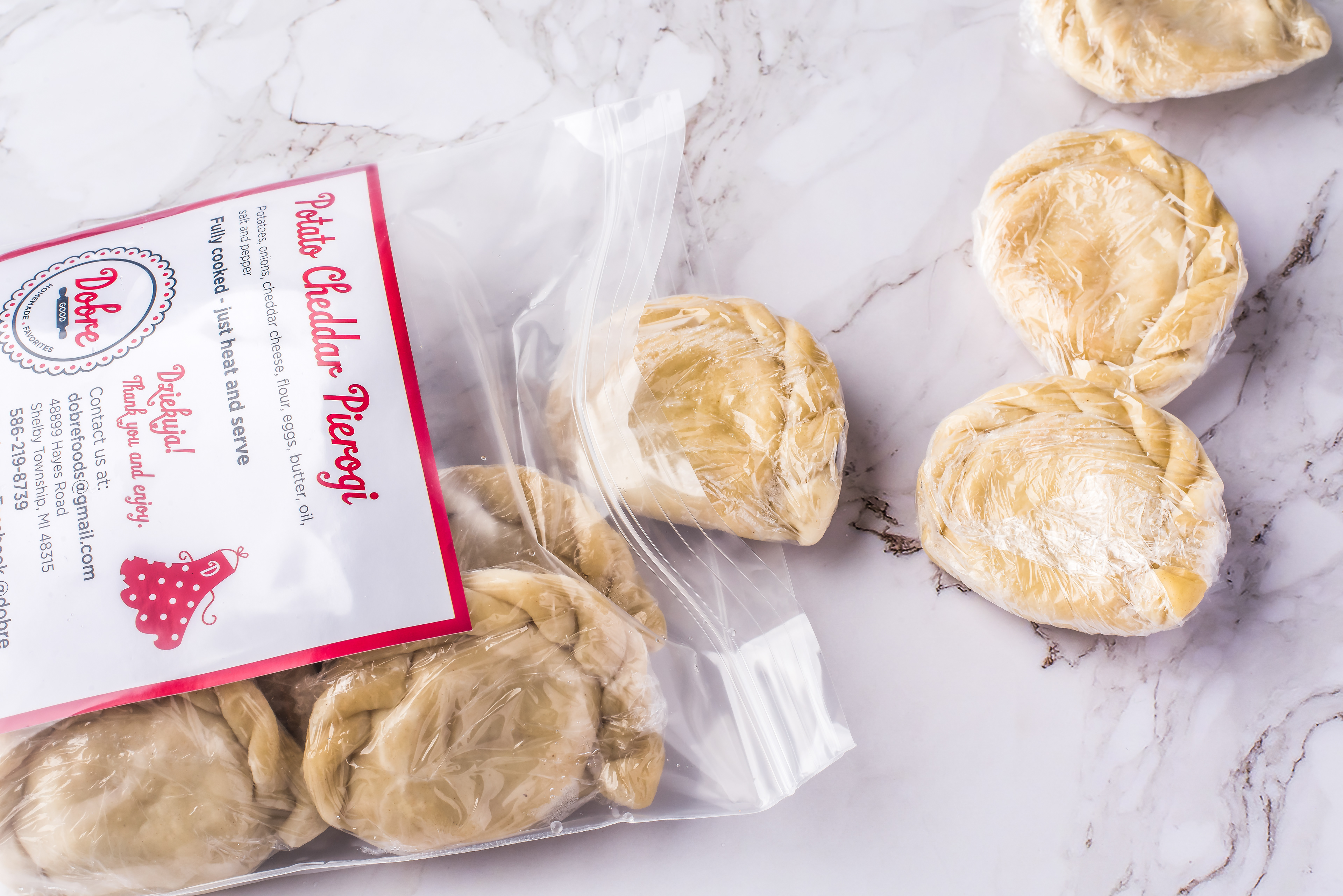
Created cost-effective packing solution for Dobre Pierogi varieties. The freezer-resistant labels are placed inside easily identifiable heavy-duty bags.
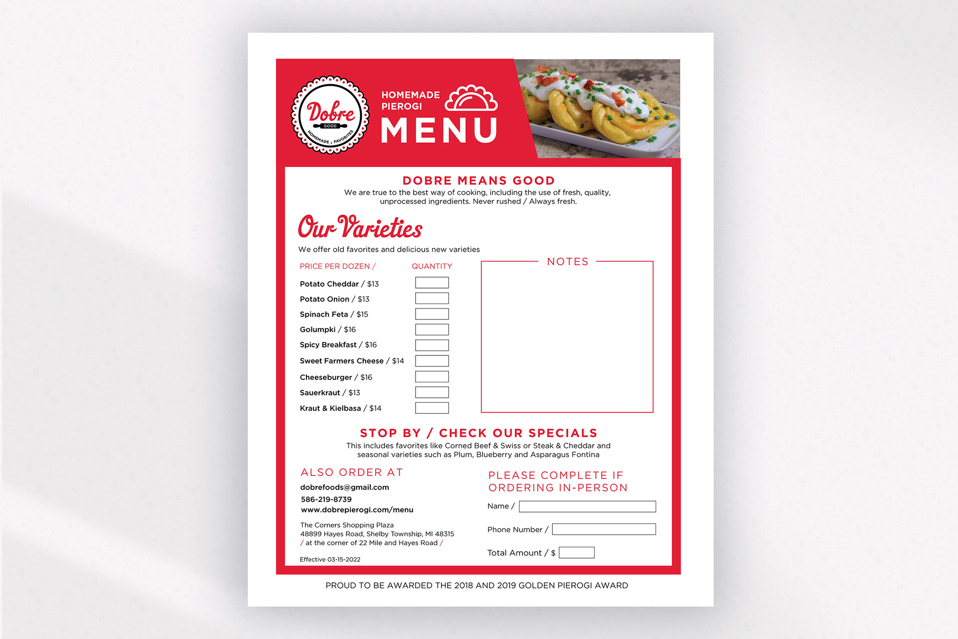
Created design solution for Dobre Pierogi menu that is easy to read and doubles an order form to reduce costs, and creates an easy way to capture in-store or event orders